There are two AI models getting the most attention right now: OpenAI's GPT 5.3 and Anthropic's Claude Opus 4.6. I've been using both extensively to figure out which one is actually better for UX designers who design and build with AI.
It's easy to compare models by looking at benchmarks and code quality. But what I wanted to understand was something different — how do these models compare when it comes to the quality of their UX design output? Does the model think like a designer? Can it make good layout decisions? Does it understand visual hierarchy and why certain UX patterns exist?
I judged both models on four things: visual quality, design thinking, designer experience, and iteration. Here's how it went.
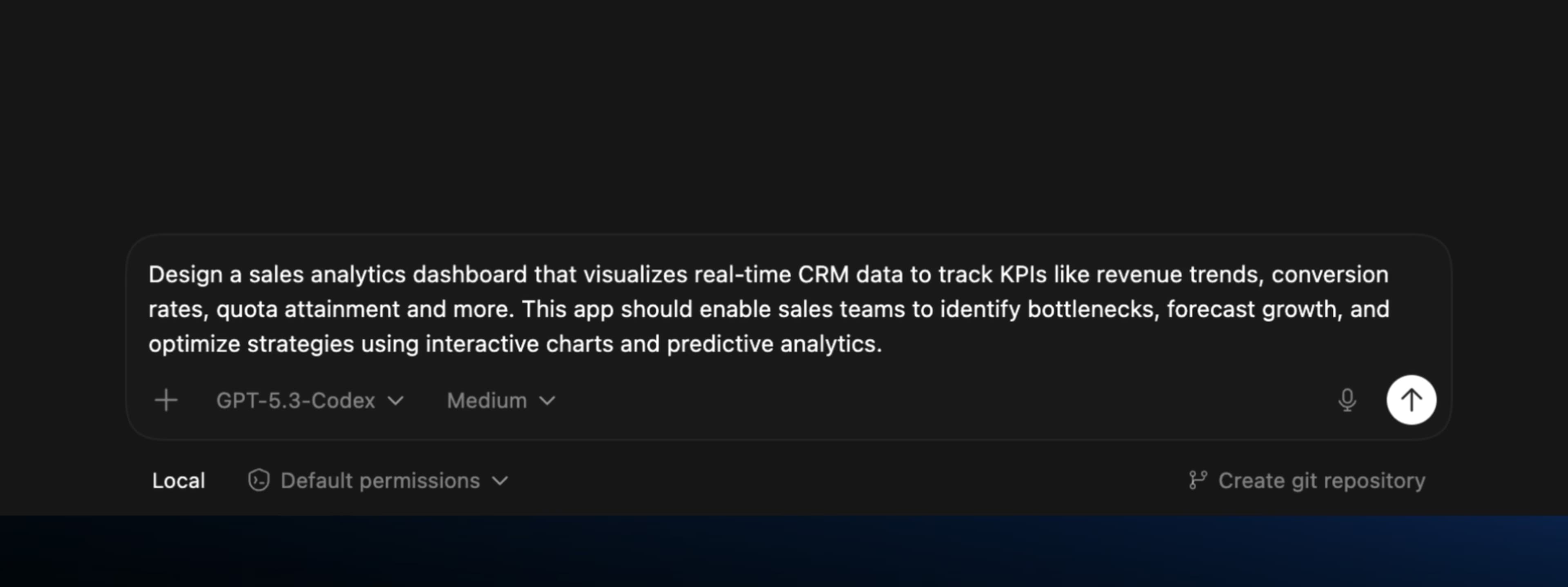
The Prompt
I used the same prompt on both models and compared the outputs directly. Specific enough to make a meaningful comparison, open-ended enough to let each model show its individual problem-solving approach:
"Design a sales analytics dashboard that visualizes real-time CRM data to track KPIs like revenue trends, conversion rates, quota attainment and more. This app should enable sales teams to identify bottlenecks, forecast growth, and optimize strategies using interactive charts and predictive analytics."
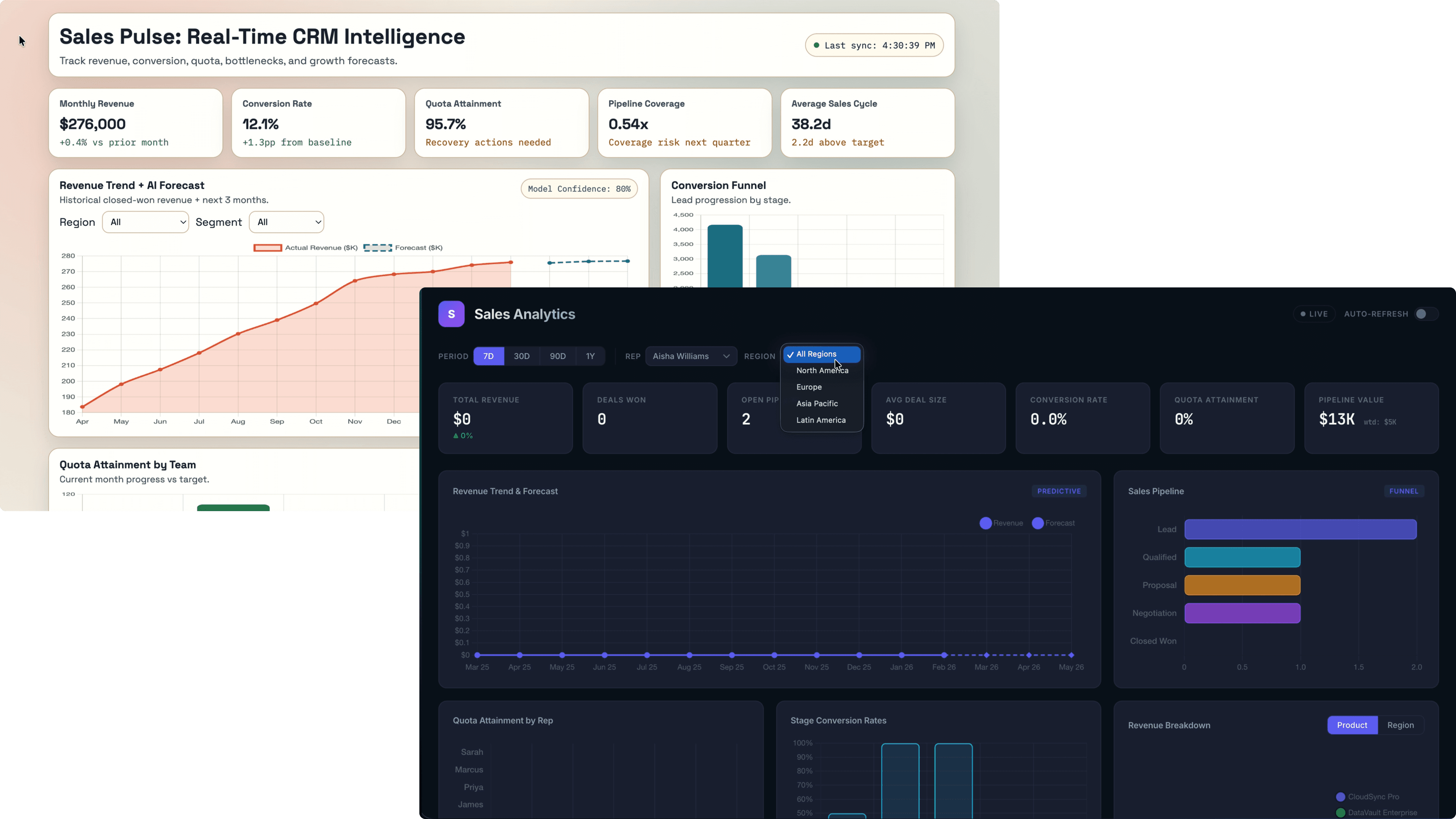
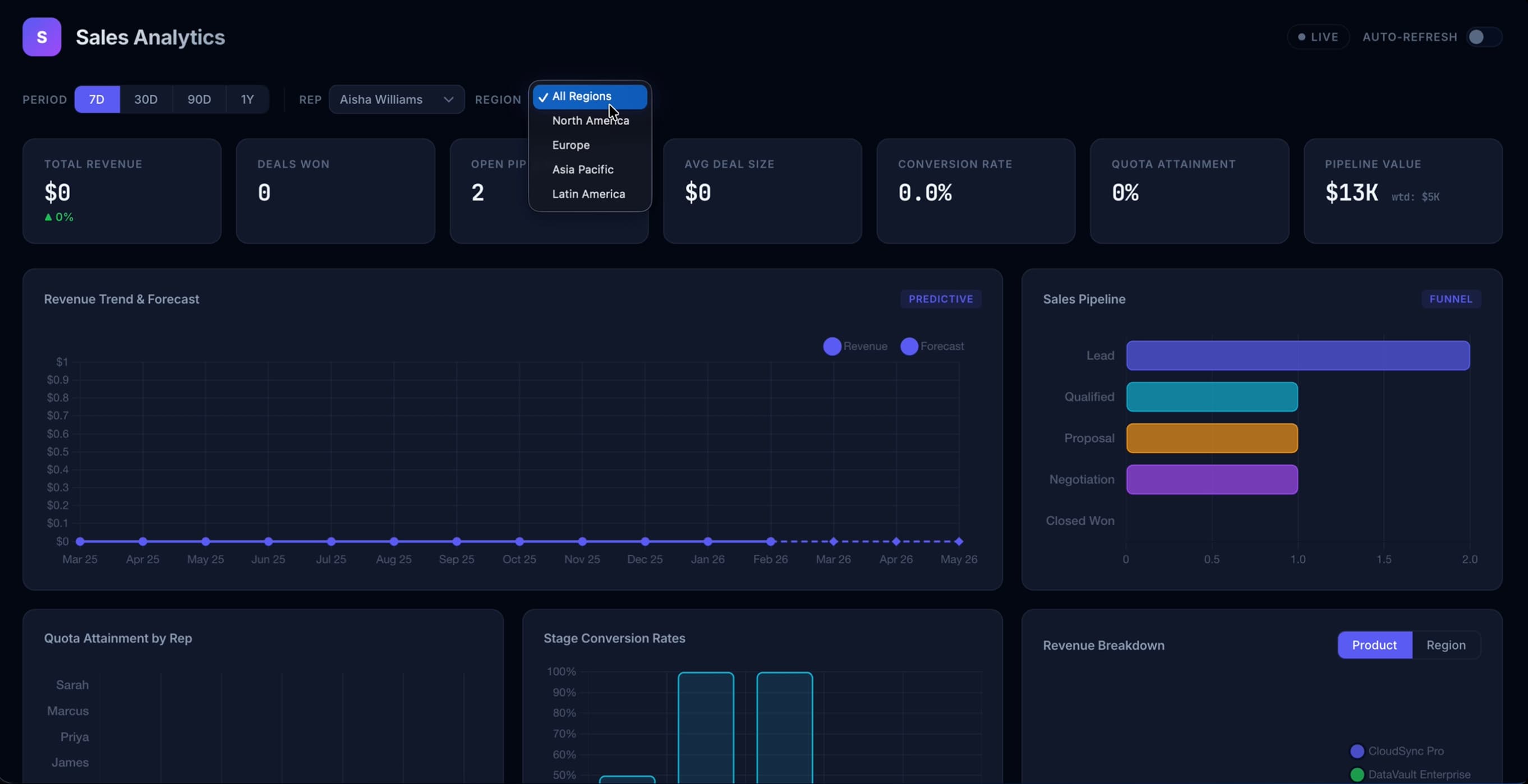
First Pass
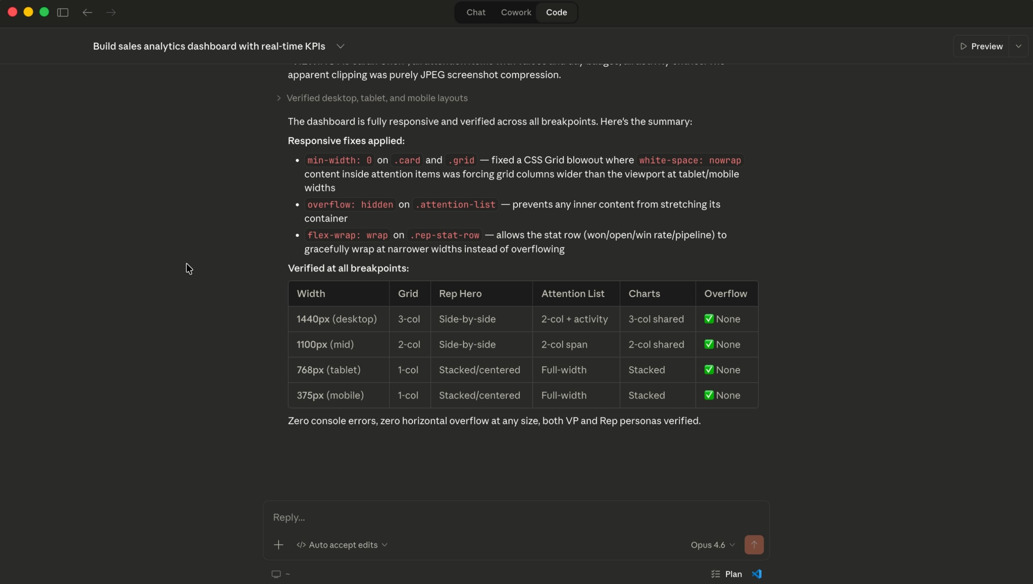
The first generation from each model sets the tone for everything that follows. This is what each model does when a real designer sits down and uses it the way they actually would — no hand-holding, no extra context.
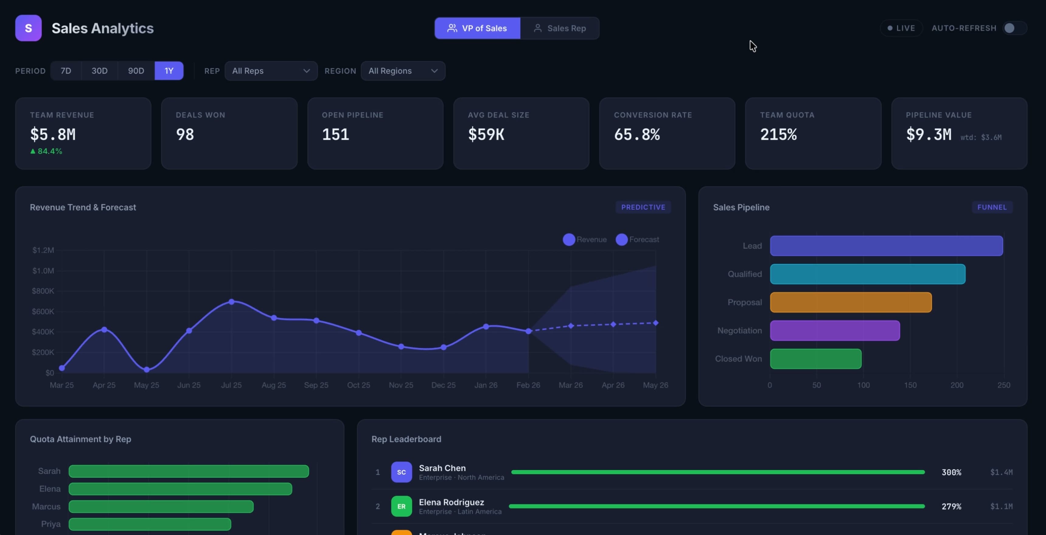
GPT 5.3
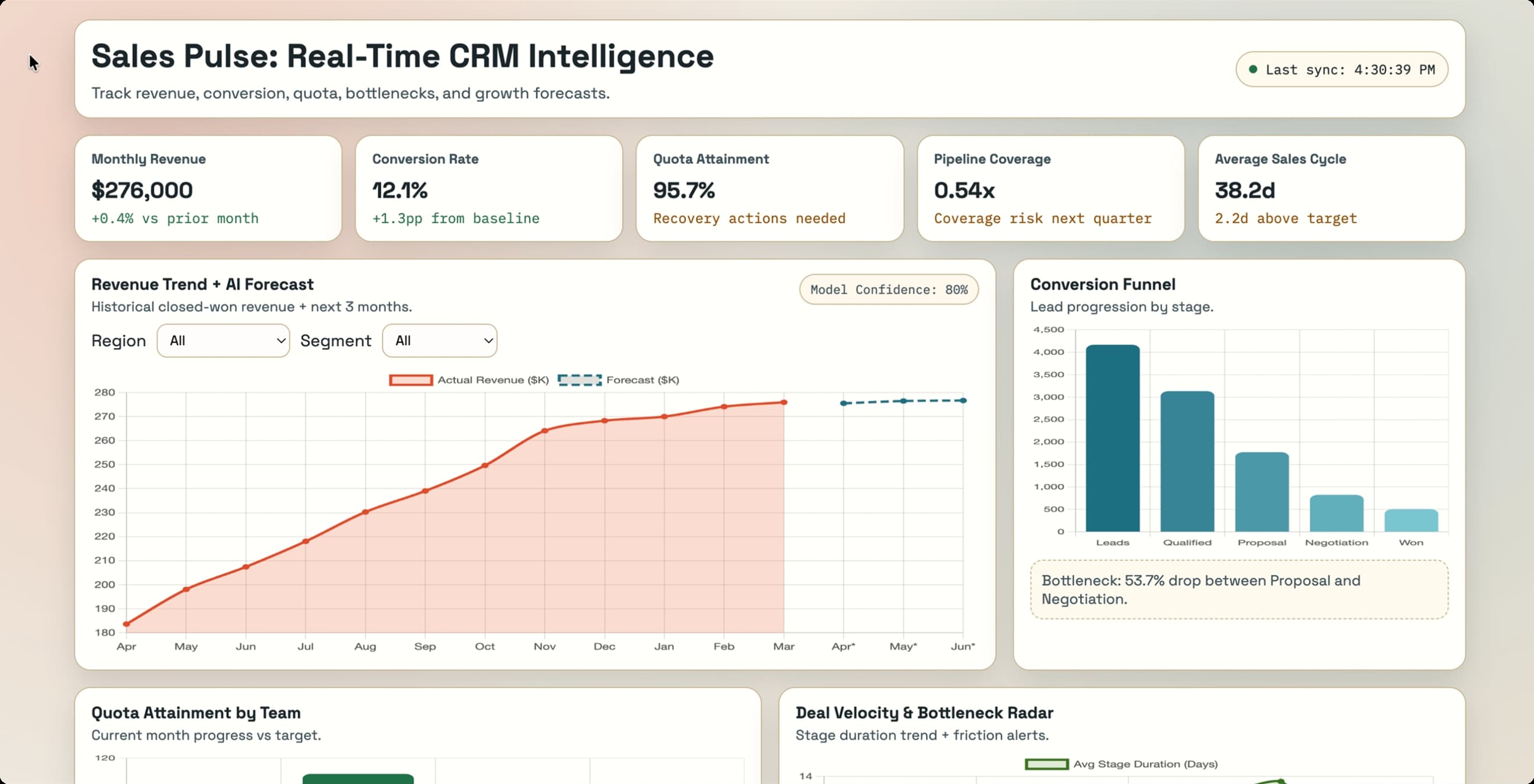
Opus 4.6
Design Thinking
Visual output is one thing. But this is the part that separates a model that's just generating patterns from one that actually understands UX. I asked both models to solve a real design problem: designing for two drastically different user types within the same product.
The prompt:
"A VP of Sales and an individual sales rep both need to use this dashboard. Their goals are completely different — the VP wants to see team and pipeline health, the rep wants to see their own quota progress and deal activity. How do you design for both users without building two separate products? Walk me through your decision, and then build an iteration."
This is the kind of prompt that reveals whether a model is actually reasoning about UX or just pattern-matching. A thoughtful answer requires understanding user goals, navigating tradeoffs, and making a justified decision.
GPT 5.3
Built a toggle selector for changing between VP and Individual Sales Rep views
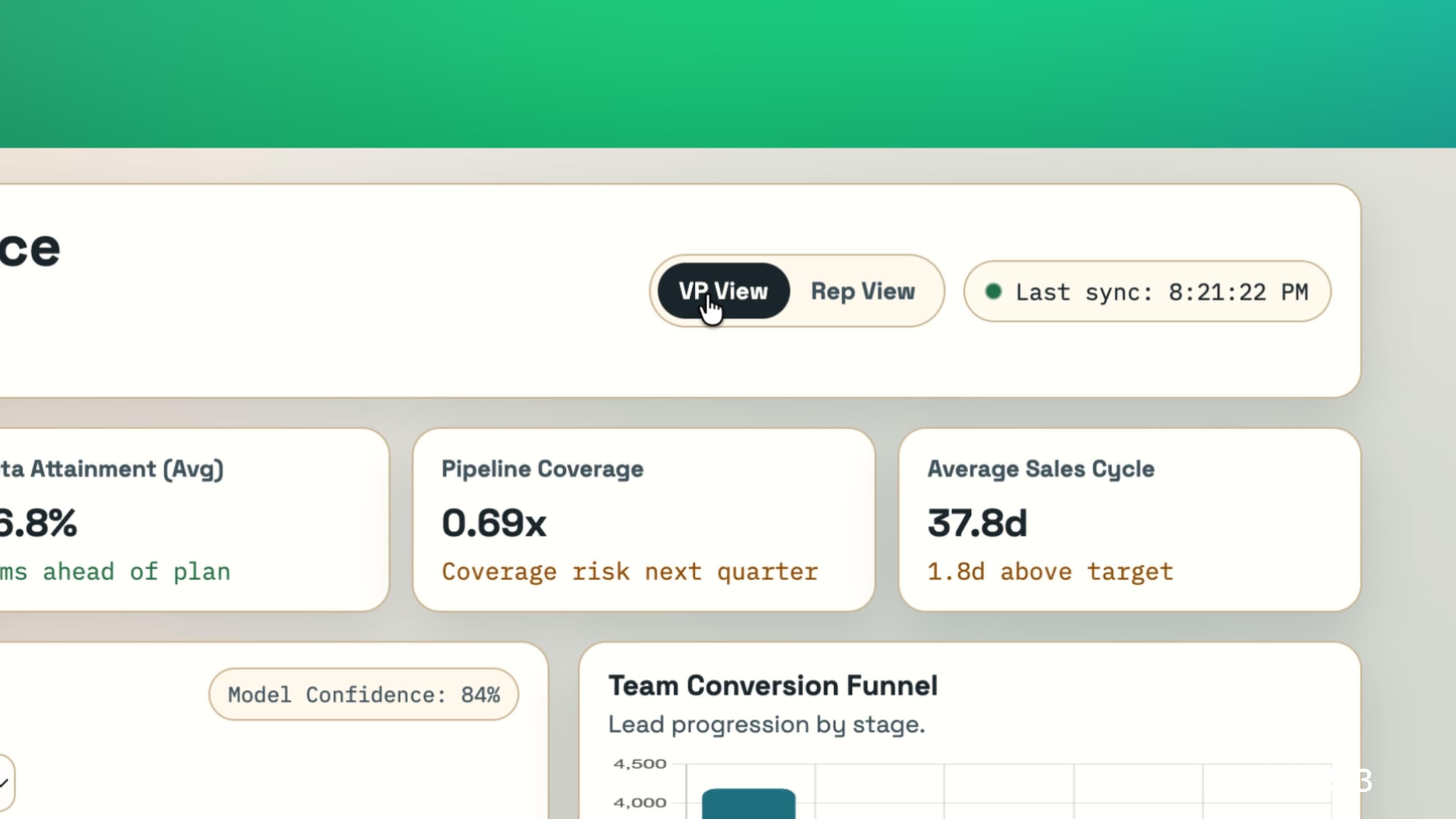
Opus 4.6
Built… the same thing! But with a dropdown for specifying which sales rep you are.
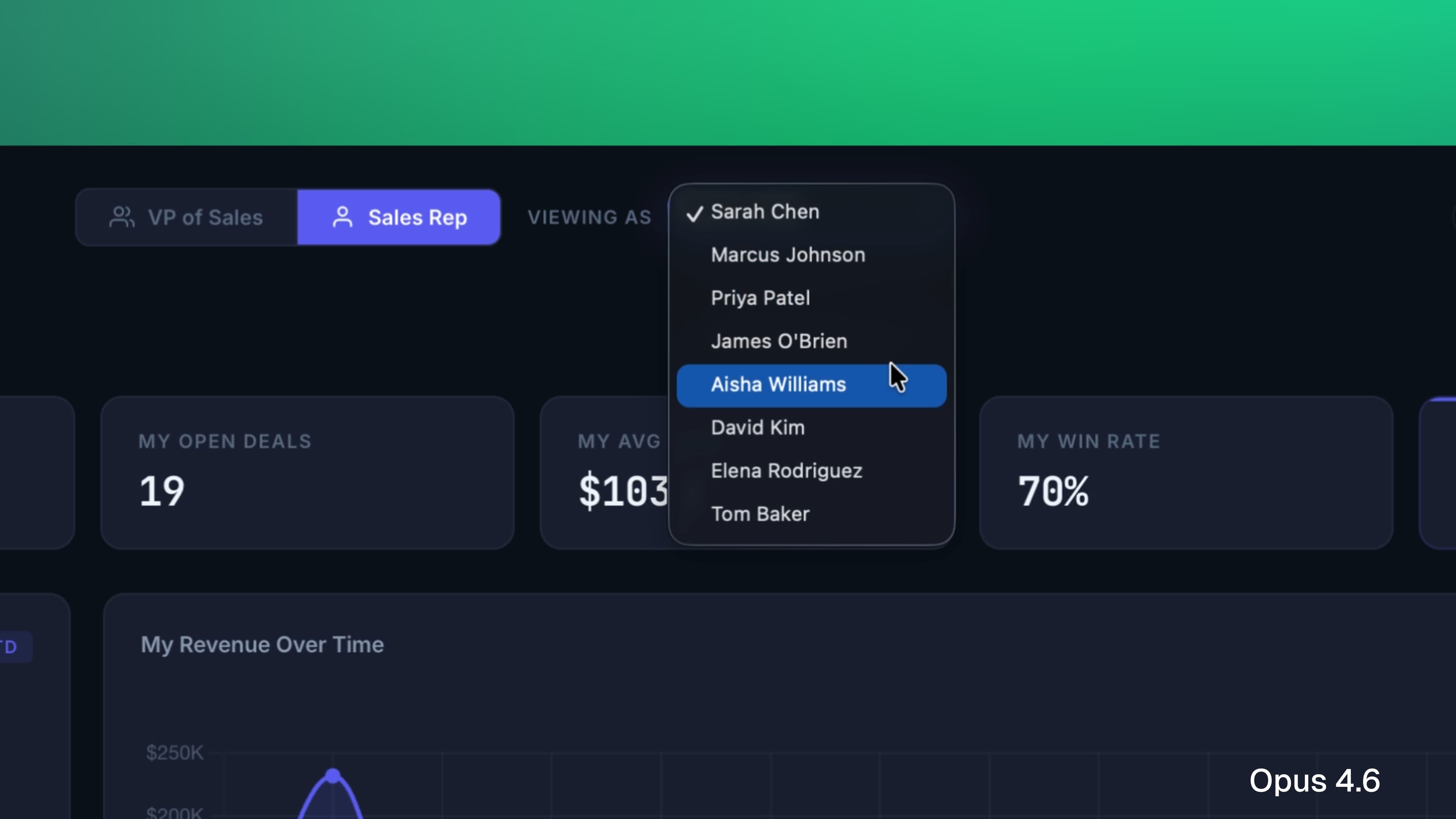
This is one of those common cases where despite being two completely different AI models, they give you more or less same solution — something that can be avoided by increasing prompt specificity.
Iteration
The real test of any design tool isn't what it comes up with on the first pass. It's what happens when you push back. So I gave both models a prompt that asked them to fundamentally rethink the layout with a specific use case in mind:
"This is looking too busy. Our sales reps are checking this between calls — they don't have time to analyze it, they need to scan it in five seconds and know exactly where to focus. Redesign the layout with that in mind. Use flawless hierarchy principles to achieve a scannable and digestible interface."
This prompt asks the model to reprioritize. It requires understanding that good hierarchy isn't just aesthetic — it's functional. The right answer means stripping things back, not just rearranging them.
GPT 5.3
Cleaned up the dashboard content, including only the most crucial information. Still a long way from a shippable MVP, but decent improvement.
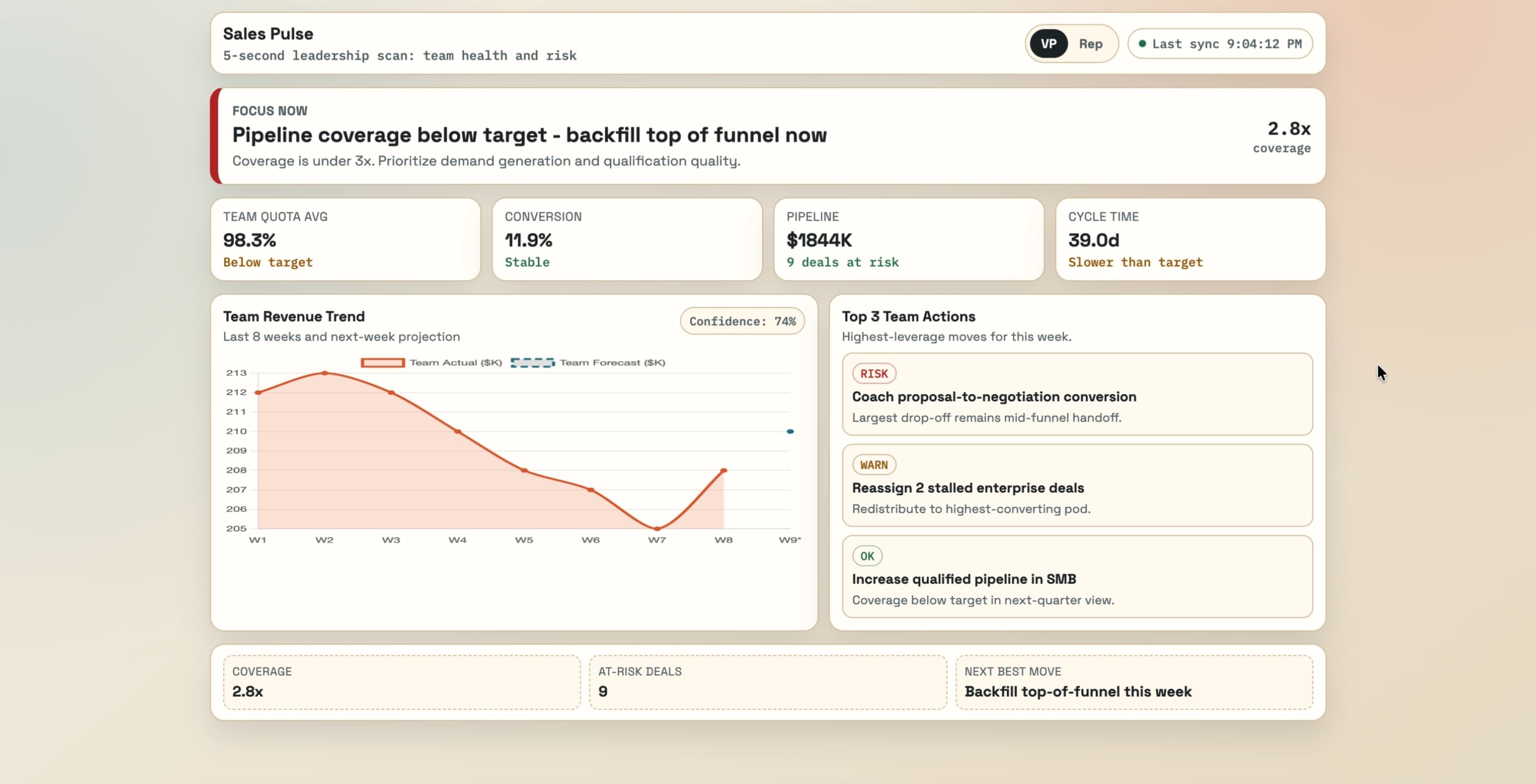
Opus 4.6
Not much of an improvement here. Removed some content but overall hierarchy remains the same.
Designer Experience
I want to step back from prompt comparisons for a second and talk about what it's actually like to use these tools as a designer — because this part of the conversation gets skipped a lot. Just like how we use these tools to design great experiences, the designer experience itself is worth analyzing.
I've spent real time in both Codex (OpenAI's agentic coding tool) and Claude Code (Anthropic's equivalent). On the surface they're similar — both let you design and build through a conversational interface. But they don't feel the same to use.
Claude Code gives you real-time updates while it's building. Codex tells you what it's done after it's finished thinking. That distinction matters more than it sounds — seeing the steps Claude is working through gives me a window into its reasoning, and that transparency builds confidence in the output before I even see it.
Claude Code also asks clarifying questions before it starts building, which is something I've come to really appreciate. It's the difference between a tool that executes instructions and one that actually wants to understand what you're trying to accomplish. On top of that, the ability to install skills into Claude Code — custom instructions that shape the quality and style of what it produces — is genuinely powerful once you start using it.
Where Codex stands out is technical precision. Developers and engineers who care about code quality under the hood will notice things that most designers won't. It's a real strength, just not one that's always relevant to a design workflow.
For designer experience, the edge goes to Claude Code / Opus 4.6.
The Verdict
Both models are capable. Both can produce work worth building on. But they're not the same tool, and understanding the difference matters for how you use them.
For technical coding precision that developers will appreciate, GPT 5.3 holds its own. But for design thinking, visual decision-making, and generating iterations that feel intentional — Opus 4.6 is the stronger model. The layout decisions, typographic choices, and hierarchy it produces feel considered in a way that reflects an understanding of why good design works, not just what it looks like.