
Anthropic just released Claude Fable 5, the most capable model they have ever made public, and it is already leading nearly every benchmark out there. If you design interfaces for a living, this is the model you have been waiting for. In this guide I will show you exactly how powerful Claude Fable 5 is for UI design, when to use it over Opus 4.8 and Sonnet 4.6, and the prompting approach that gets you stunning output every single time instead of generic AI slop.
I put Fable 5 through three real tests:
One-shotting a full dashboard from a single prompt
Building an entire multi-screen flow using the Mobbin MCP
Rebuilding a landing page from nothing but a screenshot
Prefer to watch instead? Here is the full video walkthrough:
What Is Claude Fable 5?
Claude Fable 5 is Anthropic's first publicly available Mythos-class model, and it sits a tier above Opus 4.8 in raw capability. It is the top scorer on the major end-to-end vibe coding benchmark, basically maxing out what is currently possible for UI, UX, and product design work.
The headline feature for designers is vision-based self-verification. Fable 5 does not just review its work by reading code. It uses actual vision to check its output against your original design or goal, resizing between mobile and desktop, clicking through interactions, and fixing its own bugs before handing the work back to you. When it comes time for you to review, you are reviewing finished work rather than supervising every step of the process.
When to Use Claude Fable 5 vs Opus 4.8 and Sonnet 4.6
Before you switch your default model, you need to understand the tradeoff. Claude Fable 5 costs roughly two times as much as Opus 4.8 and around 3.3 times more than Sonnet 4.6, which is the model I usually default to. So what kind of work justifies that higher token usage?
Fable 5 earns its cost on the hardest tasks, and UI design is one of them. It is much better at one-shotting entire apps, it holds a design system together across many screens without drifting, and it thoroughly checks its own work using vision once it finishes generating.
Here is a simple rule of thumb:
Use Sonnet 4.6 for quick iterations, small components, and everyday design work where you want speed and low cost.
Use Opus 4.8 for more complex work that still fits in a single focused session.
Use Claude Fable 5 when you are building an entire app, a full multi-screen flow, or anything where you want the model to plan, build, and verify autonomously with minimal hand-holding.
Claude Fable 5 Cost and Token Usage
Fable 5 is token-hungry. I am on the Claude Max 5x plan, which gives me a lot more room to run a powerful model like this. My 5-hour limit started at 68 percent before my first generation. After one prompt that built a complete dashboard, it jumped to 91 percent. That is a 23 percent increase in usage from a single prompt.
If you are on Claude Pro, you will burn through your usage quickly, especially across a full project. For that reason, treat Fable 5 as the model you reach for on high-value builds, and keep a cheaper model in rotation for routine work.
Regular Fable 5 vs. the 1 Million Context Window
When you switch to Fable 5 in Claude Code, you will see two options: the regular model and the 1 million context window version. A context window is just the model's working memory, the maximum amount of information it can see and process at one time.
As a designer, reach for the 1 million context window when you are feeding the model a lot of upfront context: an entire design system, a full codebase, or a stack of user research documents it needs to remember while it designs. For a lighter task where you are not loading much context, regular Fable 5 works just fine.
How to Write Claude Fable 5 Prompts for UI Design
This is the part that matters most, because the output is only as good as the direction you give it. A model this powerful does not reward lazy prompting. If you say "build me a dashboard with this, this, and this" in one sentence, the model has to guess what you want, no matter how capable it is.
Long, concrete, thorough prompts are what unlock beautiful output. The prompt I used to one-shot my dashboard did four specific things:
It forced design system thinking first. I asked the model to define a design system before building any components, so the output is coherent rather than component-by-component guesswork.
It anchored to realistic data. A simple "no lorem ipsum" constraint dramatically improves how finished the final UI looks.
It specified states explicitly. Hover, focus, loading skeletons, empty states. Models skip these by default unless you ask.
It set clear scope. Concrete requirements give the model a target to verify against later.
Write your prompt like a brief you would hand to a senior design engineer, then let the model plan and build against it. Here was my prompt:
Build a fully interactive dashboard for a B2B analytics SaaS product. This will be used by business analysts to identify key company performance metrics.
Requirements:
A sidebar nav with icons, active states, and a collapsed/expanded toggle
A top header with search, notifications, and a user avatar menu
A main content area with: KPI cards (with trend indicators), a line chart showing 90-day data, a data table with sortable columns and row actions, and a status feed
Use a cohesive design system - define your spacing scale, type scale, and color system before building components
Hover states, focus states, and loading skeletons on all interactive elements
All data should be realistic and hardcoded - no placeholder Lorem Ipsum
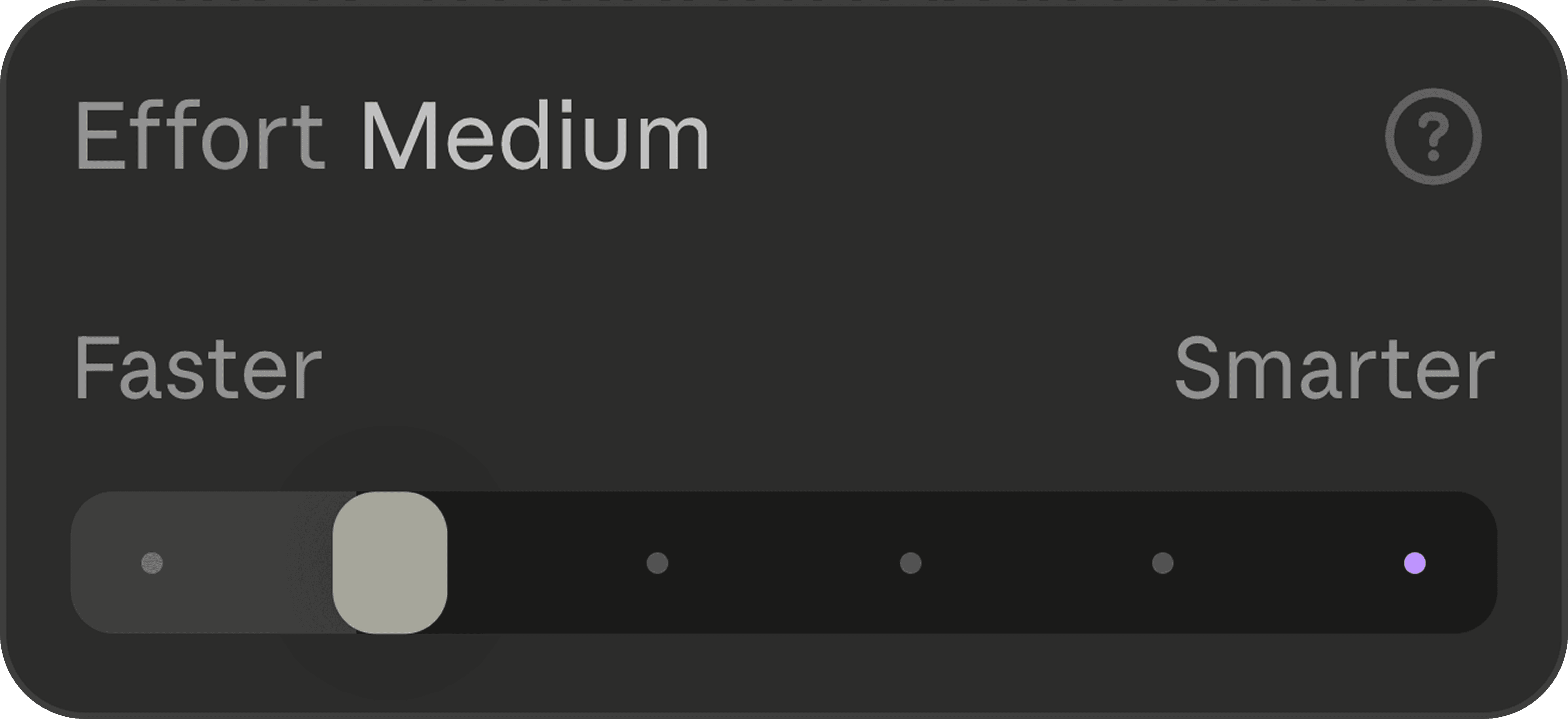
Understanding the Effort Dial: Medium, High, Extra, Max, and Ultra
Claude Code gives you an effort selector, and you should think of it as a dial for how hard the model works. For a medium-complexity project, leave it on medium. When you want deeper thinking and more rigorous verification, you can turn it up to high, extra, max, or ultra code, which is the absolute maximum effort level.
Running Fable 5 on Ultra Code means you are using one of the most powerful AI configurations available right now. It also burns the most tokens, so I usually turn it down to extra to preserve my limit. Remember that even at lower effort, you are still getting an extremely capable model, just with slightly less deep thinking and faster responses.
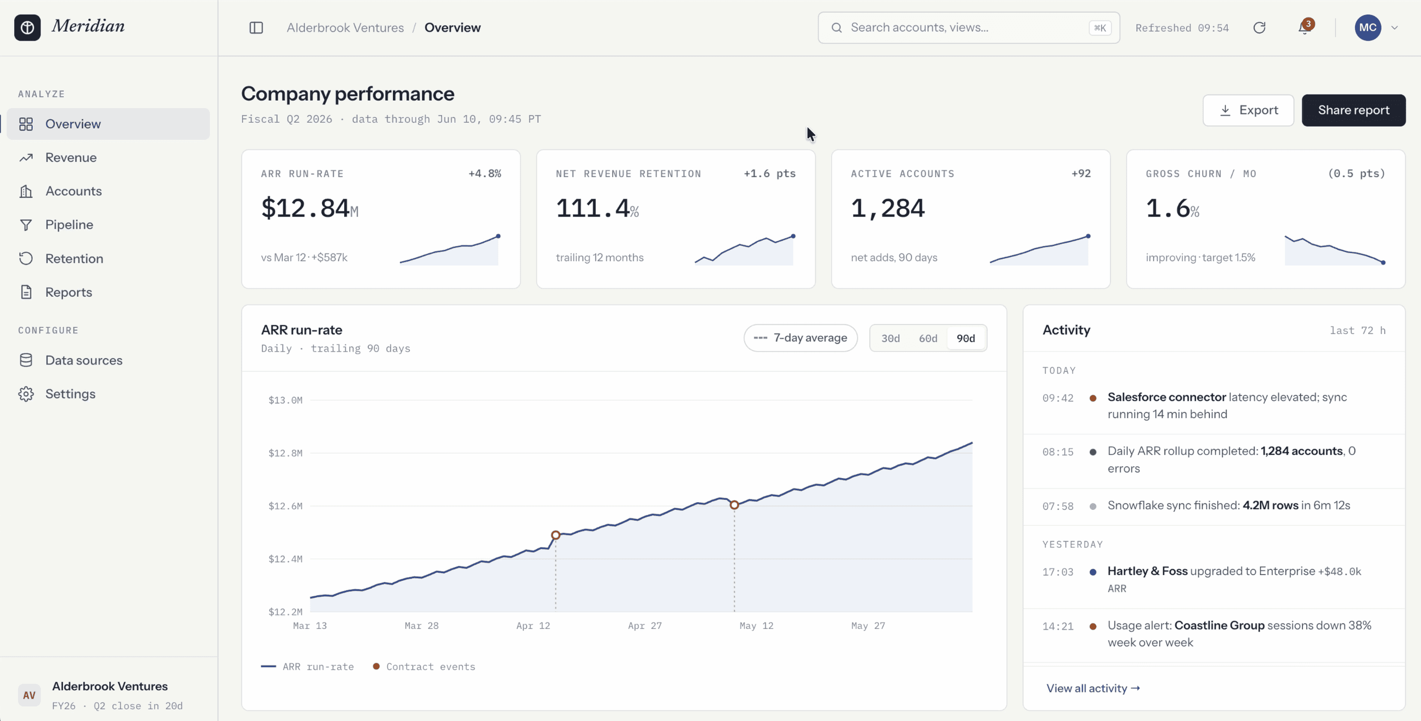
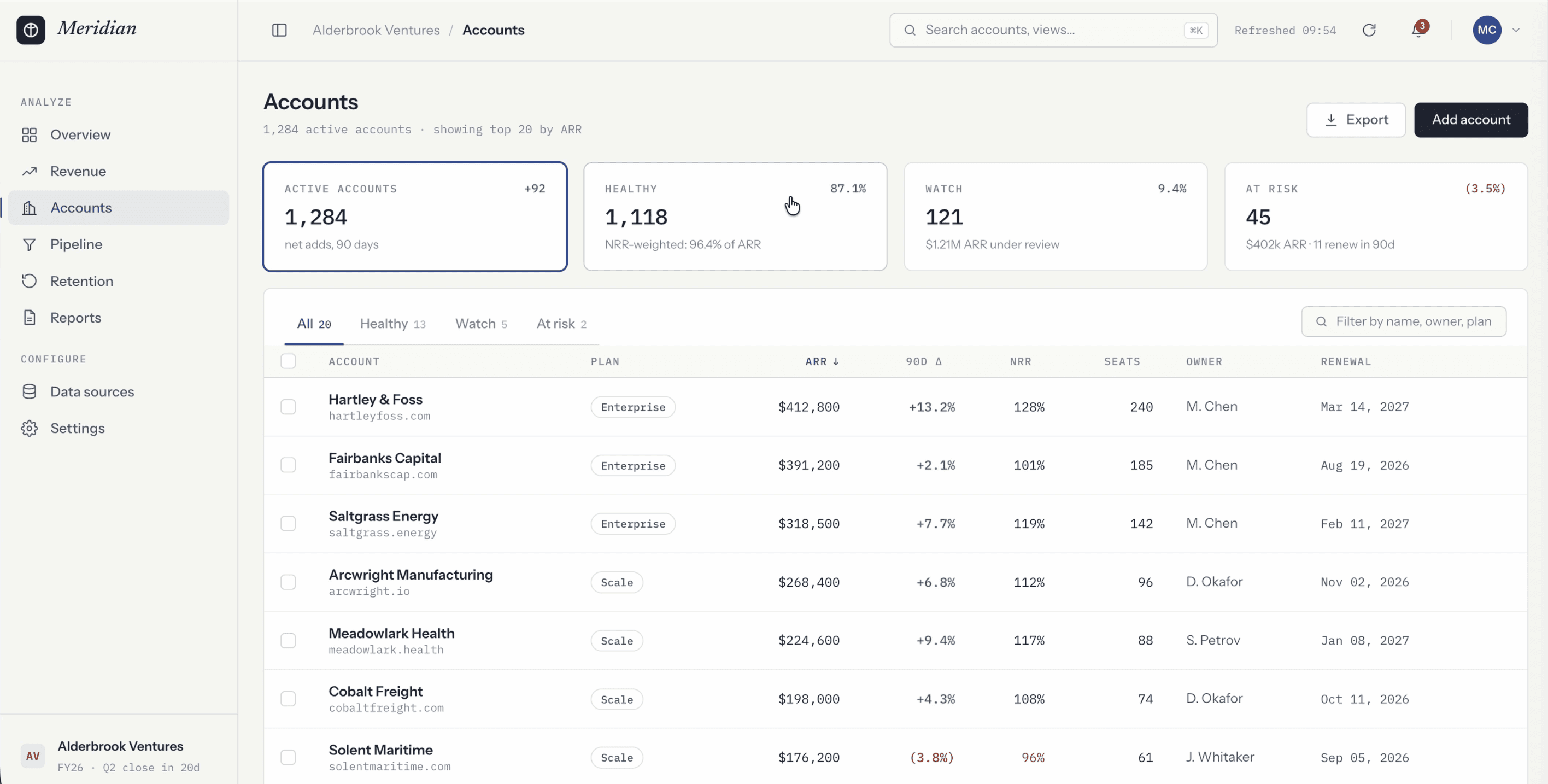
Test 1: One-Shotting a Dashboard With Claude Fable 5
For my first test, I gave Fable 5 my detailed design-system-first prompt and watched what happened. It immediately chose to run its interface design skill, which is exactly what that skill was built for: dashboard/product UI.
What followed was the most impressive thing I have seen from any model. About 10 minutes and 20k tokens in, Fable 5 started resizing the browser between mobile and desktop widths to exercise the responsive interactions on its own. It tried to change the table sorting, found that it did not work, opened the console, diagnosed the bug, and fixed it. This autonomous, vision-based review session happened in real time without me asking for any of it.
After about 25 minutes, the first build was done, and it might be the best first pass I have ever seen Claude Code produce. The interactions felt precise, the data looked realistic down to the trend indicators, the date range selectors worked, the toasts animated fluidly in the bottom right, and the sidebar collapsed and expanded with a smooth animation rather than snapping. The search bar was functional and highlighted matching rows in the table. Nothing about it read as AI-generated.
Test 2: Building a Full Multi-Screen Flow With the Mobbin MCP
A single screen is one thing. An entire app is another. The problem with building a whole flow from scratch is that the model only has its training data to rely on, so it can drift into generic patterns.
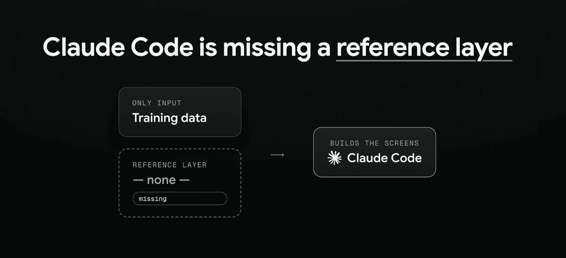
The fix is to give it a reference layer. I pointed Claude Code at Mobbin using the Mobbin MCP. Mobbin is a go-to resource for professional designers, with over 600,000 screenshots of real mobile and web apps from companies like OpenAI, Cursor, and Vercel. These are patterns that have actually shipped to real users, which is how you know they are reliable rather than just pretty.
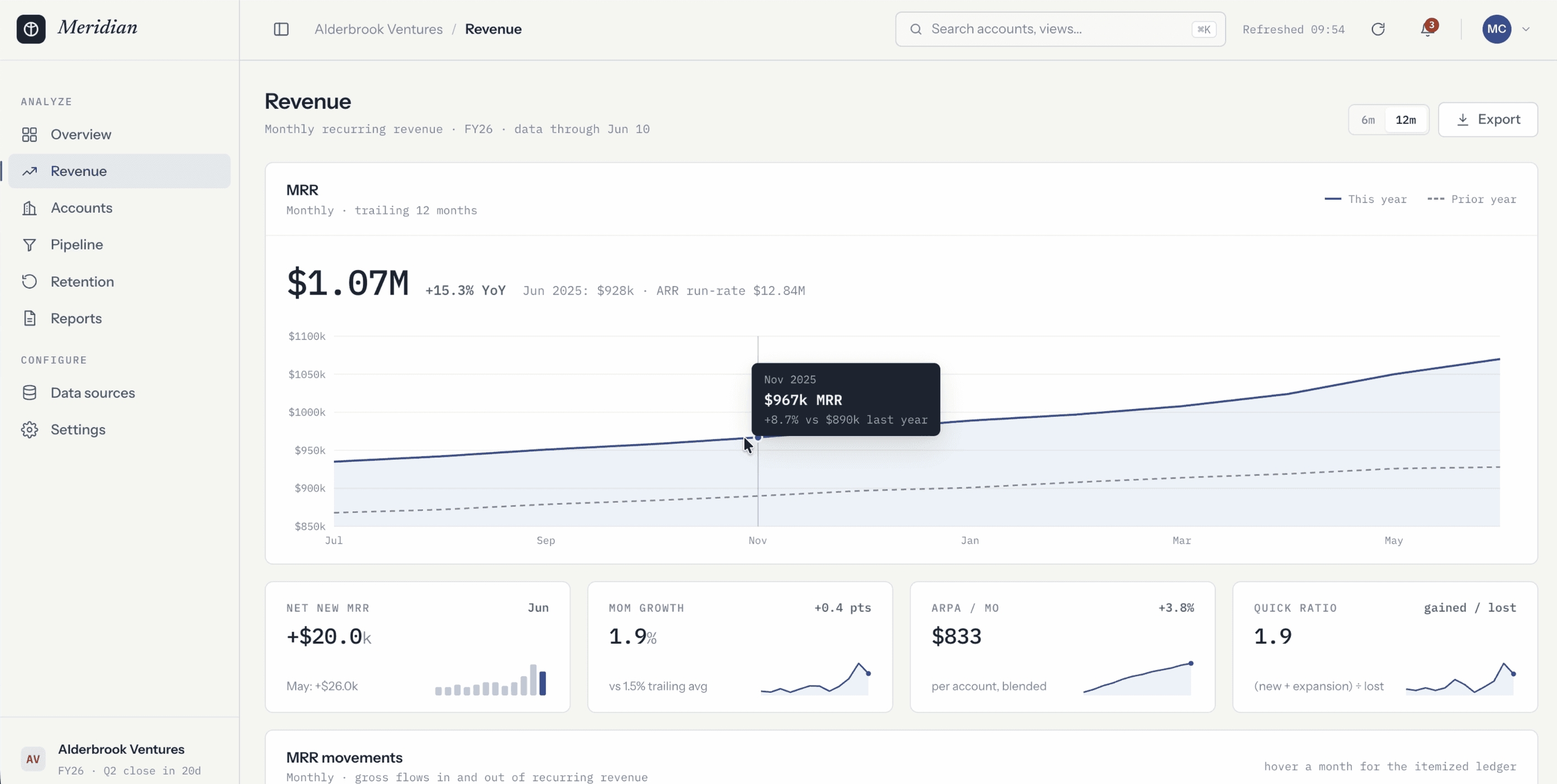
Instead of manually digging through hundreds of screens, I told the agent to study the most relevant designs on Mobbin and use them to inform new revenue, accounts, and settings pages. I also asked for a complete visual report of everything it referenced, so I could verify it actually did the research.
The result was excellent. Fable 5 delivered all three screens plus an HTML report showing it had referenced top dashboards from Stripe, Mixpanel, HubSpot, and Squarespace, with a note on each explaining the specific pattern it pulled. The revenue page matched the overview page's styling exactly. The accounts page had functional KPI selectors to filter the table. The settings page split everything into clean tabs, drawing on the settings pages of Figma, Coda, Render, and Pitch, complete with a member management table, toggleable notifications, and a polished billing tab.
The key takeaway: Fable 5 does not drift off the design guidelines and component styling it already established, which is a problem you have probably hit with other models.
👉🏼 Try Mobbin today here: https://mobbin.com/?via=griffin
Test 3: Screenshot to Code, and Whether Claude Fable 5 Is Good for Web Design
For the final test, I gave Fable 5 a screenshot of the entire Stripe landing page and asked it to rebuild the page from scratch in HTML, CSS, and JavaScript. I deliberately did not point it at stripe.com, because I wanted to test pure vision skills rather than let it read any source code.
The results were mixed. On the upside, it implemented a dynamic animated shader in the background that shifts color, which is something I have struggled to get other models to do. On the downside, the attention to detail dropped off. The hero section looked noticeably different, company logos came back as plain text instead of real logos, and the more complex graphics, like Stripe's node-network visualization, were either skipped or replaced with safe, standard-looking sections. Telltale signs like emoji inside cards and generic gradients gave away the AI origin.
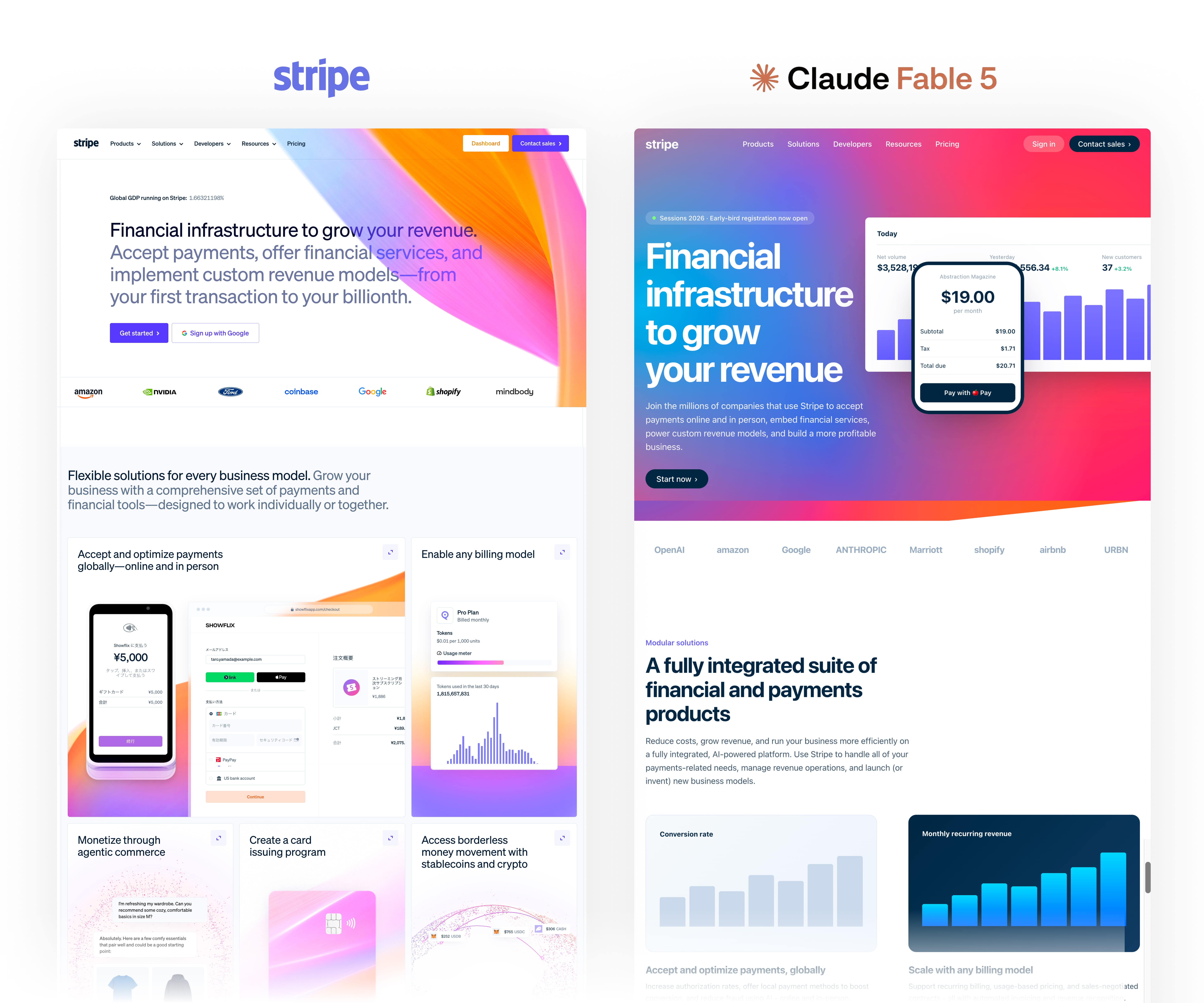
So is Claude Fable 5 good for web design? For polished marketing pages with complex custom graphics, it still plays it safe and your job as a web designer is secure for now. For product UI, UX, and dashboard work, it is a genuine leap forward.
Final Takeaways
You have now seen what Claude Fable 5 can do from a single prompt, how it handles a full multi-screen flow with the Mobbin MCP, and how it performs at turning a screenshot into code. The thing worth remembering is that the output is only as good as the direction you give it. Fable 5 produces truly impressive interfaces, fast, but it is still responding to your taste, your judgment, and how well you can describe what you want.
The design thinking does not disappear. It moves earlier in the process, into the prompt and the references you provide. If you are a UI, UX, or product designer, this is an exciting time to be working. Set up a thorough design-system-first prompt, give the model a strong reference layer, tune your effort dial to match the job, and go see what you can build.