Mashgin, 2025
Cashier UI
Decreased transaction times by 28% with a redesigned POS UI

Team
2 Product Managers
4 Engineers
1 Data Analyst
My role
Conceptualization
Qualitative research
Design
Prototyping
Design systems
Dev handoff
Duration
3 months
Context
The future of retail checkout
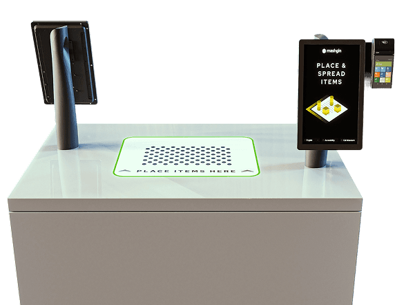
Mashgin is the industry leader in AI-powered checkout. Whether you’re at a convenience store or airport, place your items on the kiosk’s base, and several hidden cameras automatically detect what you’re buying.
Mashgin kiosks are equipped with a customer-facing UI (minimal, mainly for showing items in cart) and a cashier-facing UI (more features, gives cashier control over transaction).
It’s self-checkout when everything goes perfectly, but at its core it’s staff-assisted checkout, making our user base both customers and cashiers.
I joined Mashgin as their first full-time designer and led design efforts to make the future of checkout more efficient and enjoyable.
Background
Reimagining the cashier experience
Staff Checkout was the cashier's original UI for handling transactions.
Cashier UI extends the Staff Checkout experience with a redesigned POS interface that's more usable and feature-rich.
The Problem
The need for a full-feature POS system
As Mashgin expanded into more complex retail environments, Staff Checkout began to slow down store operations. Cashiers often ran into challenges caused by the limitations of the original Staff Screen, including:
Item management
Viewing customer-side UI / item tray
Control over kiosk’s core features
Support/troubleshooting options
The design challenge was to evolve the Staff Screen into a true point-of-sale experience that let cashiers assist customers, complete transactions, and troubleshoot directly from one unified interface.
User research
Competitive analysis
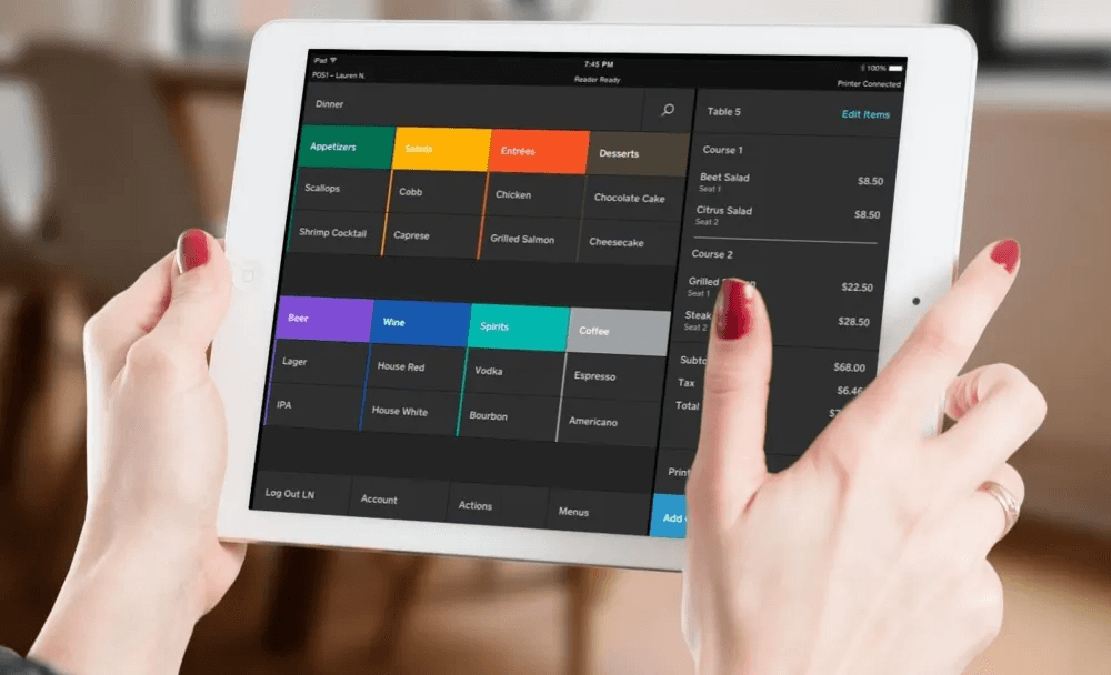
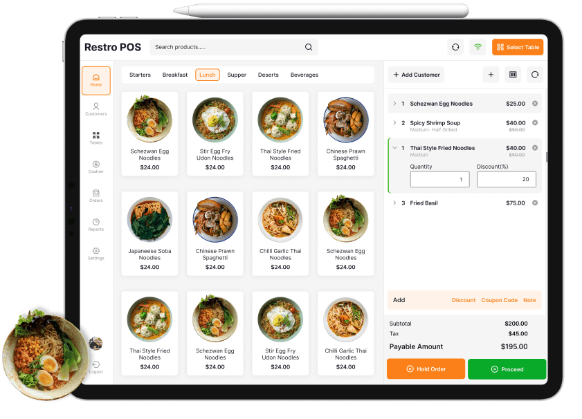
There’s a wide range of POS interfaces out there — big names like Square, Shopify, and Toast, and then the clunky old-school ones that cashiers are all too familiar with.
What works well:
Convenient tile-based layouts for speed and ease of use
Clear, eye-catching payment CTA’s
Intuitive cart management controls
What goes wrong:
Overly complex and cluttered
Poor handling of edge cases and errors
Limited training/troubleshooting resources
Field research
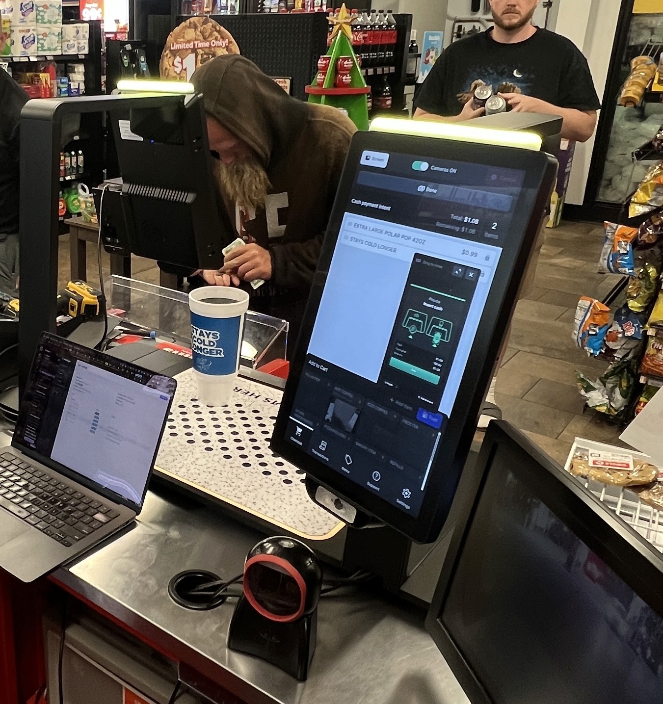
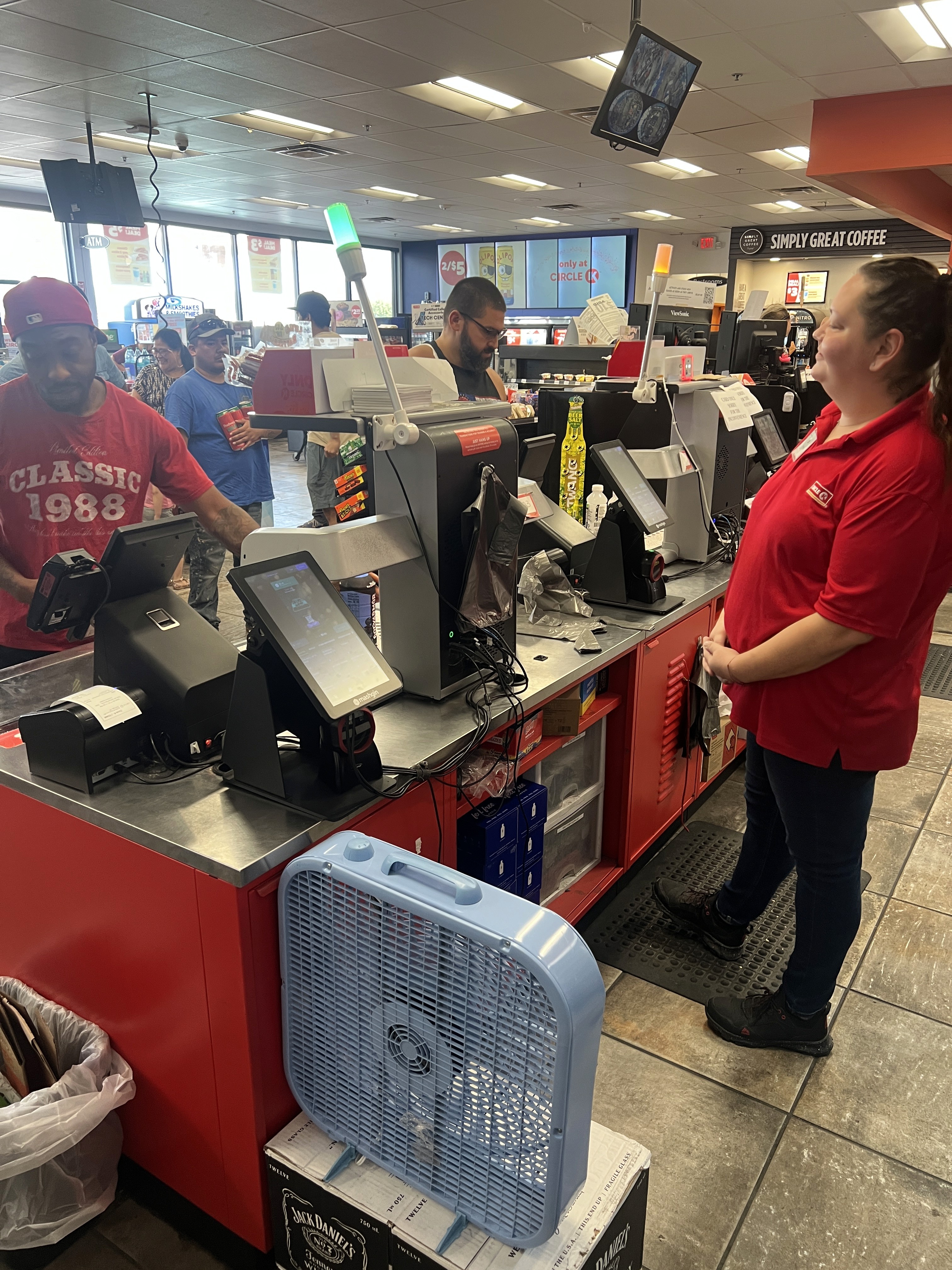
I made two trips to Phoenix, AZ where we have a high concentration of Mashgin sites. I visited 3 of them to immerse myself in the convenience store environment, collect in-depth insights about how cashiers use Mashgin via user interviews, and study hundreds of real-time transactions.

Understanding the painpoints
Speaking to cashiers and managers to understand their biggest painpoints confirmed many of our initial assumptions of cashier painpoints, but also taught us that they’re often:
Frustrated by item misrecognitions and performance issues
Unaware of many kiosk features and resort to traditional cash register to perform actions that could’ve been done using Mashgin
Team workshops
With a fresh understanding of our users, I collaborated with my teammates to map out task analysis, user flows, and the information architecture for the redesigned cashier experience.

Design Process
Wireframing + Ideation
With a clear understanding of our end users’ most common workflows and painpoints, I kicked off the design process with wireframing, laying the foundations for Cashier UI’s most essential features.

Building an MVP ASAP
Design System
Crafting a reusable and accessible design language
Designing a UI for cashiers required a dedicated system rather than borrowing patterns from Mashgin’s customer-facing kiosk. Cashiers interact with the product under very different conditions: fast pace, constant interruptions, and a heavy reliance on repeatable muscle memory.
I also had to account for a wide variety of ability levels across our user base, so adhering to accessibility guidelines like WCAG was crucial.
I built the design system with these pillars at the front of my mind: control, clarity, predictability, and accessibility.

Testing
Replicating the cashier experience
To test my designs in a realistic setting, I used my at-home kiosk setup with an actual Mashgin display, replicating how cashiers interact with the system.
When I found bugs or design inconsistencies, I worked directly with engineering to make sure Cashier UI matched the intended Figma designs.
Solution
How we fixed the cashier experience
We solved our core user problems with new and improved features that enable a fast, controlled, and transparent checkout experience designed for real store conditions.
Streamlined item management

Add to cart
The slow, text-heavy item picker was replaced with a fast, image-driven Add to Cart drawer built for cashiers’ pace.
Quantity adjustment
Cashiers can now adjust quantities directly in the cart, eliminating repeated scans and speeding up a previously tedious task.

Smarter item categories
Categories are now tailored to each store’s inventory, letting cashiers surface the right items without sifting through irrelevant lists.
Better visibility into transaction state
PiP customer screen
A Picture-in-Picture window mirrors the customer screen, giving cashiers instant clarity on what customers are seeing without leaning over the counter.
Clear transaction status
The UI now shows transaction status and remaining balance, so cashiers immediately see customer progress without relying on verbal updates or guessing.
More support when things go wrong
Autoscan control
Cashiers now have a clear way to disable autoscan when vision struggles, allowing them to switch to barcode scanning immediately without fighting the system.

Report a Problem
Cashiers can submit an issue to Mashgin support in seconds without leaving Checkout.

Built-in learning materials
The new Feed page keeps the cashier up to date with new features, help videos, support status and more.
Launching v1
After three months of direct cashier interviews, field observations, internal workshops, and continuous iteration, we delivered Cashier UI v1 to production. We're continuing monitoring real-world usage and refining the experience based on the day-to-day needs of the people using it most.
Impact
28% faster transaction times
Across our A/B test, the new Cashier UI delivered a substantial improvement in checkout speed compared to the previous Staff Checkout experience.
We observed:
90 transactions on Staff Checkout (average 48.4 seconds)
81 transactions on Cashier UI (average 34.8 seconds)
This represents a 13.6-second reduction per transaction, making the new Cashier UI 28% faster on average.
At a typical convenience store handling roughly 1,500 transactions per day¹, this improvement scales dramatically, saving approximately 168 hours of checkout time per month.
Takeaways
Balancing automation with human connection
This was my most ambitious project yet. At many points, I had to completely reshape what I thought I knew about the cashier’s checkout experience, especially after getting out in the field and having thorough, honest conversations with the cashiers themselves.
Many customers and cashiers made it clear that they dislike Mashgin. Some view the kiosks as another step toward technology replacing real human interaction, and that concern is valid. Their feedback underscores an important responsibility moving forward: continue improving the checkout experience in a way that feels efficient, but never cold or dystopian. Keeping the cashier integral to the checkout experience will help us achieve that.
I also learned the importance of measuring your designs’ success once it’s in production. Learning the massively positive effect that they had on cashiers and customers felt so rewarding but also validated all of the hard work on this project from everyone on my team.
Next Steps
Looking ahead to v2
In the future, my team plans to introduce more exciting features as we learn more about our cashiers’ workflows and how they’re adjusting to Cashier UI, potentially including support for:
Horizontal display orientation
Managing multiple kiosks using one display
Translation, EBT, Lottery, and more!
References
